
VINAYA
MY ROLE
Customer insights and ideation
Worked along with our product manager, visual designer, physiologist and social anthropologist to uncover insights about customers behaviour and motivations to then translate these into features.
UX strategy and vision
Created user stories, user journeys, wireframes and prototypes to share the vision, design principles and content strategy of the company.
Planning and scope definition
Defined the scope of our products and their features in conjunction with the CTO and product manager. I was also responsible for prioritising these into the product roadmap.
Oversight and coordination
Coordinated between data, hardware, product and marketing teams to ensure deliverability throughout the life cycle of the project.
THE CLIENT
Vinaya specialised in using research and technology to create wearable technology products for modern life. One part design studio, one part research lab, it was driven to create beautiful solutions that elevate human potential.
PRODUCT BACKGROUND
When Vinaya set up to design high end wearable technology (ALTRUIS) the mission was to help people be more disconnected from their mobile phone without missing important calls and notifications.
They wanted to create an intuitive and easy to use app that allowed their customers to filter notifications from contacts they considered important to them. Once ALTRUIS was paired with a mobile phone, only notifications from these apps or contacts were notified through a series of haptic feedback patterns on the wearable device.
As a small company with no UX designer, Vinaya created an app called Kovert. This app had a complex setup and many hidden features that made customers struggle to understand how to set up their ALTRUIS and most importantly, the full benefits of the product.
CHALLENGE
Collected user data showed that our users didn’t stay engaged with the product. We found that users still had difficulties understanding basic app features, like notification filtering and device pairing. Users also felt that little value was achieved while using our product. As a consequence the product vision shifted towards improving our users emotional and physical well-being. This required to introduce features like; mediation, step counting, breathing exercises, well being and motivational content, among others. However, the existing app architecture was already very convoluted thus a complete redesign was required. We wanted to create a completely brand new app that addressed these problems and also allowed to introduce new features while maintaining backwards-compatibility with current ALTRUIS features.
APPROACH
Evaluation of current features
Before kicking off the design stage of our new app, we needed to determine the main pain points of the current app (ALTRUIS). To do this, we collected and analysed data from different sources;
Cross-referenced user data gathered from our analytics platform (Kibana).
Conducted one-to-one interviews, where the main focus was to understand which features users struggled the most with, which ones they liked and used the most, and finally, which ones they thought were missing from the app.
We ran focus groups and testing sessions, where the participants would use our wearable for a couple of days. A group of the participants were given an introduction to the core features available. Another group of the participants were not given any instructions or details about the product whatsoever. Then we collected their feedback and thoughts regarding their experience with our wearable product and its companion app.
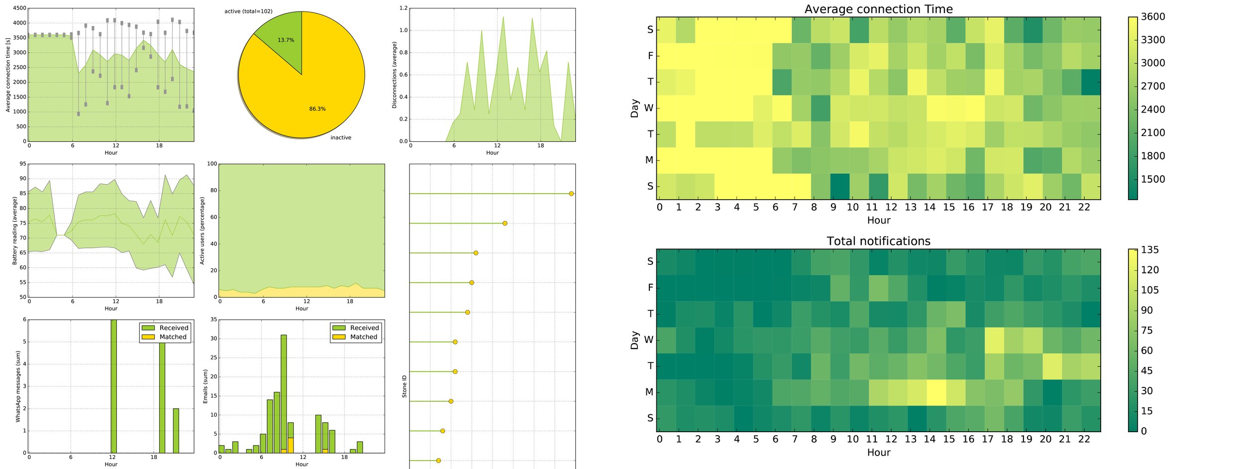
Analysing the data from usage in order to better understand the user
Researching for new features
We formed a small team to research industry trends, competitors, current and potential customers. This team consisted of people from across different areas within the company (Business, Design, Product) . As the person in charge of coordinating the research process, I proposed to implement GOB (Get Out of the Building) as our first approach. We asked people from our target audience (Millennials) about their personal struggles when it came to become a better version of themselves (being more active, being more social, learning good habits, unlearning bad habits…) and what kind of solutions they WISH they had for to these struggles. When the initial stage of the research was concluded we had a deeper understanding of our target audience, the industry and a product market fit. To finalise our research and translate these conclusions into real features, we ran workshops to come up with solutions and key action points to address these on our next product (ALTRUIS X).
The visual designer and I created designs for how these screens and features could look like before we carried out validation sessions. During these sessions we let participants (current users) to try out these new features. More feedback was collected during these sessions. At the end of our research we had a list of well validated product features for ALTRUIS X product roadmap.
Exploration of new features
DISCOVERY
Evaluation of current features
Fom the data that was collected during the usability testing of the ALTRUIS app, we could make the following conclusions:
Onboarding: Many users complained that the onboarding was too lengthy. This process required the users to register an account, pair their wearable device and set up a notification profile (home or work) before they could login into the app. In the meantime these setup stages didn’t provide enough information into the app features.
Features: It was not clear to the user how the different features worked. Their main struggle was to set up the notification filtering properly. They often failed to set it up, which led them to the incorrect conclusion that the wearable did not work properly or it was defective. A set of users thought they would have prefered to filter notifications based per type of app (ie. text, email, whatsapp) instead of contact name. Many users struggled with telling apart different haptic feedback patterns (vibrations) to discern notifications from their selected contacts.
Engagement and reward: The motivation for using the wearable decreased quickly, since many users didn’t see the value of continue usage over time.
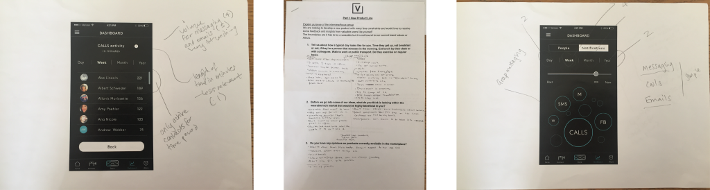
Screenshots of Kovert app on-boarding
Researching for new features
Our research showed that people struggled with:
Finding balance and overall wellbeing: Many people struggled with finding calm in their stressful everyday life. They wanted an app that they could use at any point during the day, to help them find peace again. The apps that already existed on the market didn’t meet their needs, as these just offered one service, such as meditation, breathing, or steps. People said they would like an app that combined all these elements.
Habits: Several people wanted to change their habits, such like to stop smoking, drinking less coffee, or drinking more water, but few succeeded.
Interactions with other users: During testing sessions, we discovered that most of our users had not only bought our wearable because of its design but also for what our brand represented. They wanted a feature in the app that would allow them to connect and interact with other like-minded people from all over the world.
Impact on everyday life: Our final conclusion was that our users didn’t have a good insight into how many notifications they received over one day. Neither did they have a good understanding of how much their phone usage influenced their everyday life, or how these can relate to each other.
APP RE-DESIGN
Current features
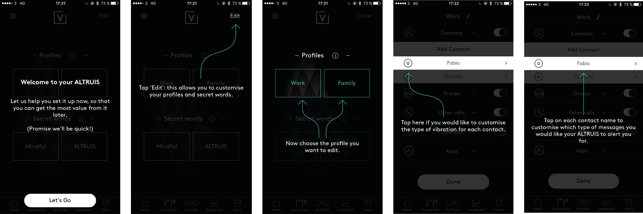
Onboarding: The main goal was to simplify and shorten the onboarding while maintaining the user informed about product features. We redesigned the onboarding to allow the user to register a new account and immediately after being able login into the app to use features that did not require to pair a wearable device (Breathing, Meditation, Habits logging, Wellbeing content, Events). Features like device pairing and notification filtering could be setup at anytime once logged into the app.
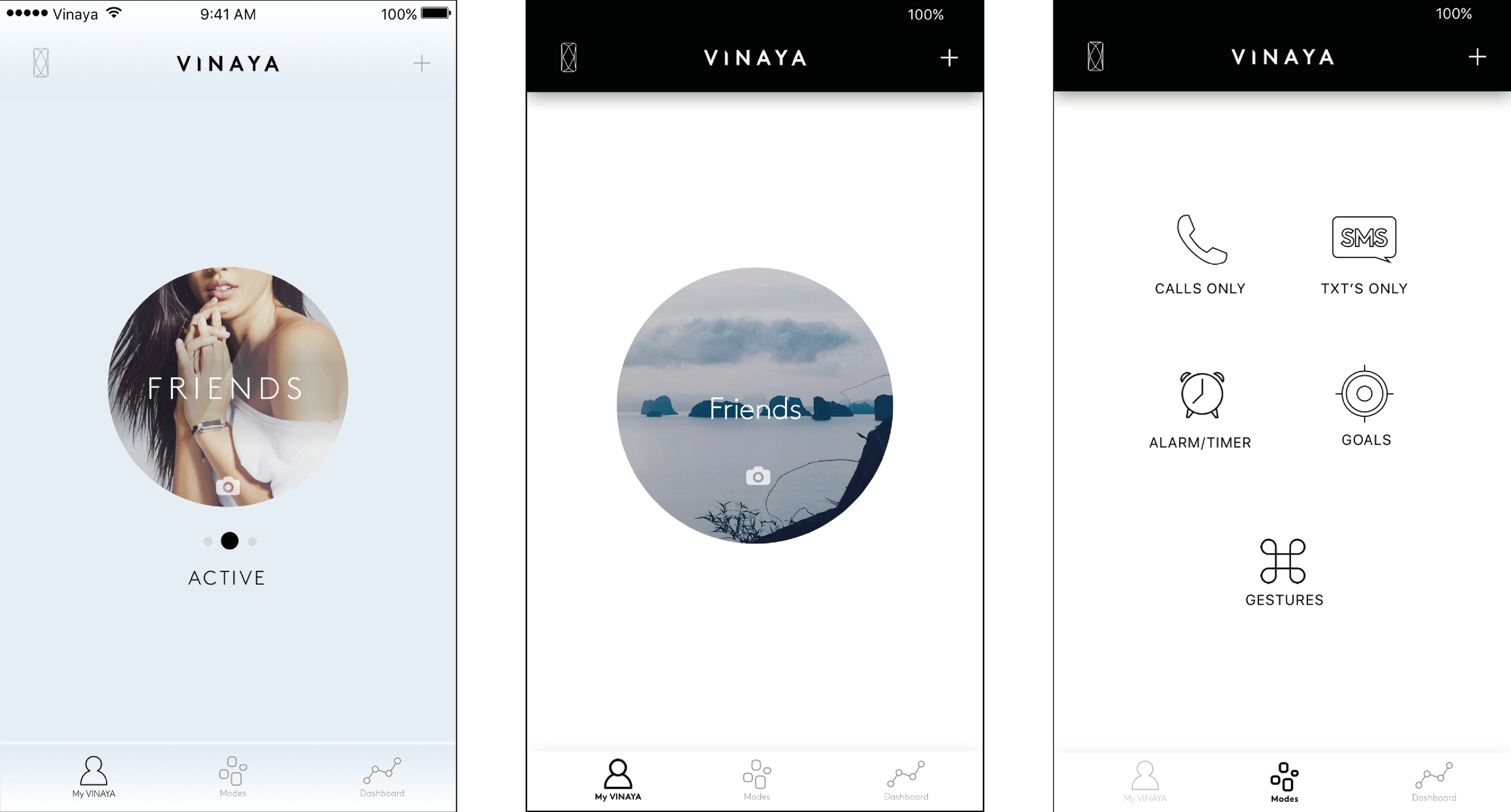
Features: We started to explore the possibility of filtering notifications by app instead of by contact name. Each app would have a haptic feedback pattern (vibrations) associated with it to uniquely identify a notification from that app. ie. A call would be a series of long buzzes, an instant message from whatsapp would be 2 short buzzes. However, we soon realized that it would become very difficult for an user to distinguish notification patterns as more apps were added for filtering. Although we recognised most users wanted a special kind of haptic feedback for calls, which is considered the most important type of notification. This led us to introduce a new filter that was called “All Calls”. In order to make easier to differentiate between vibrations I performed acceleration waves analysis and operative set-up evaluation to determine what motors should be used. Once I had a selection of motors and had the new haptic feedback patterns, I tested the haptic feedback on people in the office.

Wireframing ideas for the new app
New features
Finding balance and overall well being: Even before the GOB research, we had ideas about what potential features to implement. These were features related to physical and mental wellbeing, such as step counting, sleep tracking, meditation and breathing exercises. By implementing these, we would empower users to find peace in their stressful day. During the GOB, we validated our hypothesis when we asked participants whether these features were important to them.
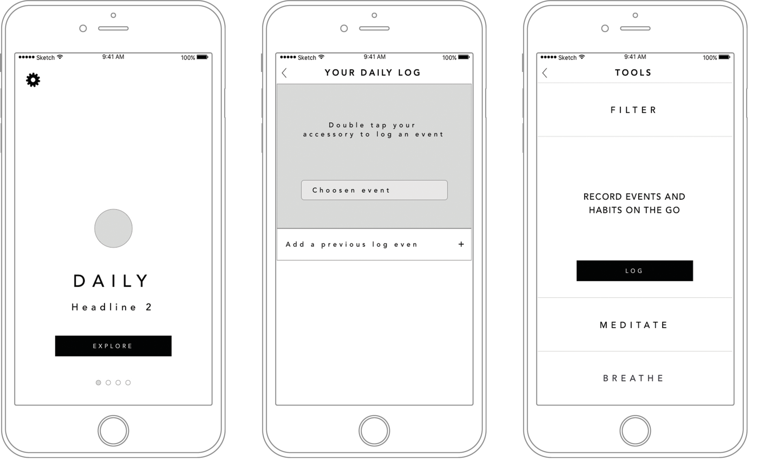
Habits: In order to help the user to change their habits is necessary for them to acknowledge their current behavioral patterns. We therefore decided to introduce the feature “logging” (behaviour logging). An user could at any point during the day register “intent” of performing/not-performing a habit by simply double tapping the wearable, or manually “logging” it the app.
Interaction with other users: In a bid to connect more to our users, Vinaya decided to introduce “Tribe”. A strategy lead with community in focus aim to bring people which identify themselves with the culture of our brand; ambrace present, find tranquility, and take time for clarity and reflexion, through events and daily inspirational content offered through the app.
Impact on everyday life: We decided to create a feature that would allow the user to better understand how the use of technology through their mobile phone could influence other aspects of their lives. We explored the possibility of correlating different parts of an user’s everyday life cycle, such as emails received, step per day, time to bed, perceived sleep quality, meditation activity, notifications and social media usage to offer a greater insight and serve as motivation to alter these habits.

Conclusion from one user study, defining what features the different users will have access to
PUTTING THE FEATURES TOGETHER
Based on our analysis of previous and new features, the product manager and I created user stories to encompass all the product functionally. I also arranged a workshop to create personas, only when these were well defined then we moved onto the design stage.
The initial idea for the architecture of the app was to have one static screen and a nav bar, which allowed the user to navigate through the app. However we wanted to build a scalable app that allowed us to inject through a CMS dynamic content sections, so we decided that a cards slider would be more appropriate for this kind of requirement. This raised another challenge, content layout within each section (card). We associated features/content that were connected to each other, this process left us with 4 well defined cards; Daily, Insights,Tools, and Tribe.
After the design and architecture stage was completed, we created wireframes for each app screen and iterated through their design multiple times. The screens we had to spend more time on where the screens that would contain more complex elements, such as setting up filtering or logging a habit. For the notification filtering screen, we’ve already decided to remove the notion of notification profiles. To ensure that it would be easier to set up a notification filter for a specific contact, we introduced increased visual feedback; toggles, enable/disable colors.
During the whole design process I worked closely with the UI designer and the visual designer. Throughout this process I was also responsible for ensuring technical feasibility from mobile, data, software and hardware teams.
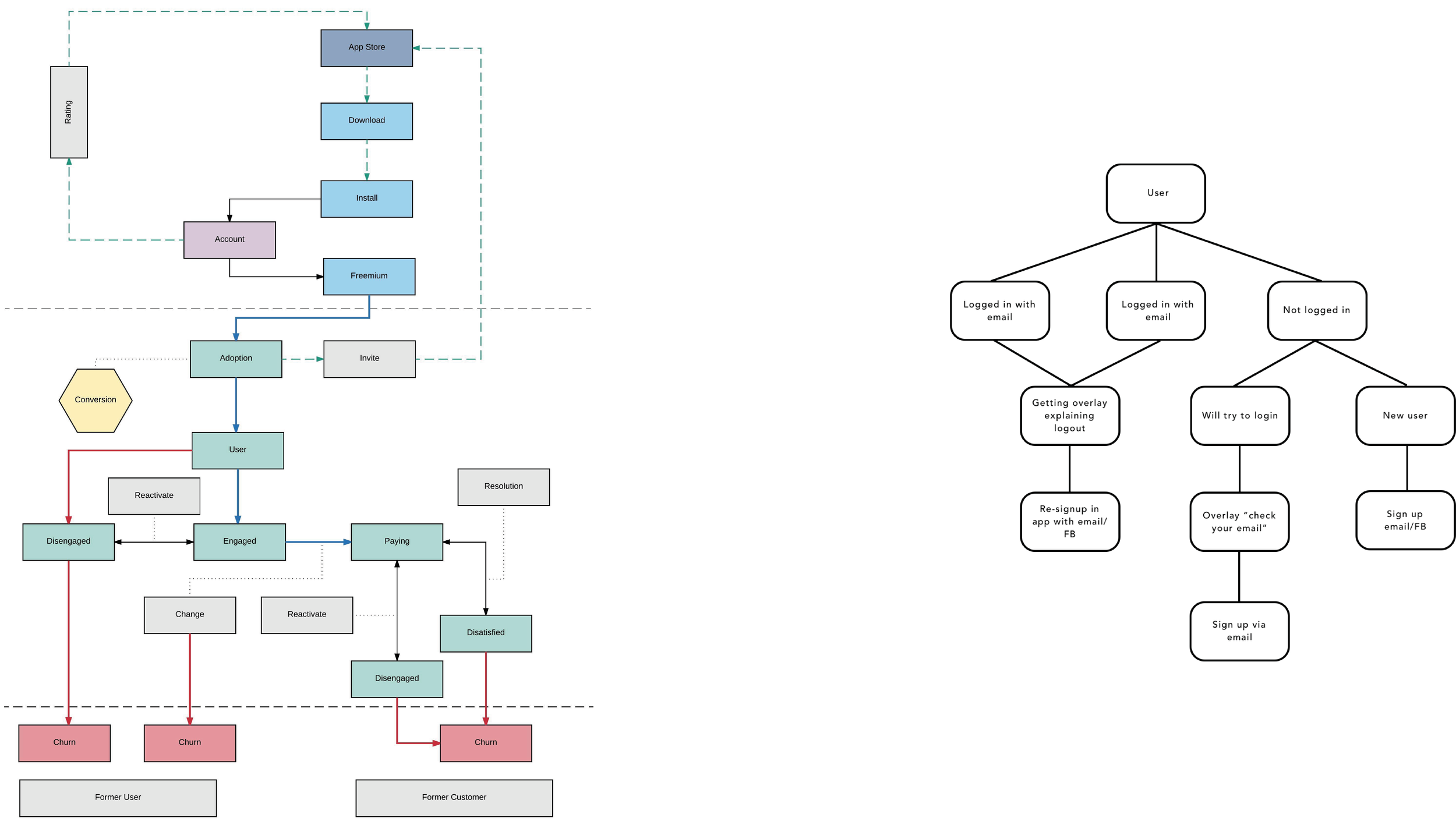
Defining a different parts of the user journey and the user engagement
There were many different suggestions for the new app design
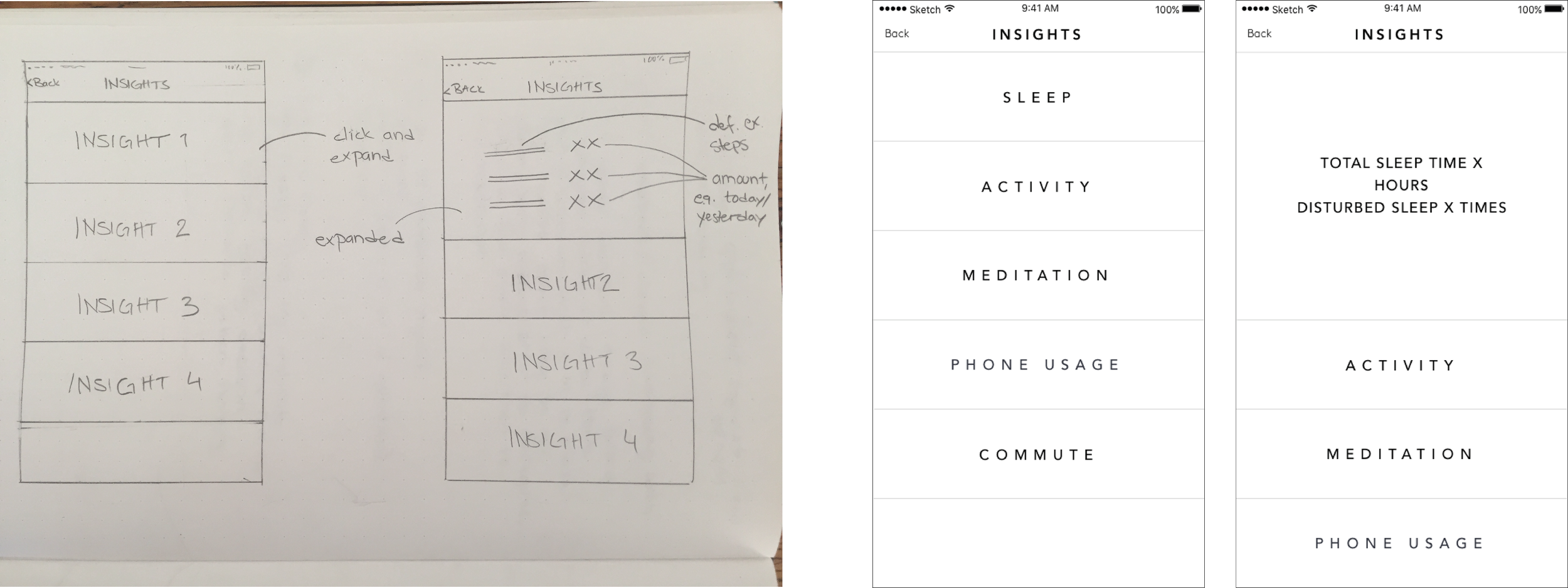
Wireframes for insights
Wireframes for the final screens
VALIDATION
After the Vinaya app was finalised, we conducted usability testing to ensure the main pain points we’ve identified from the ALTRUIS app had been resolved and that the new app delivered a new set of useful features. Two colleagues and I conducted usability testing sessions. We formalised goals, hypotheses and defined all the tasks we wanted the participants to perform. It was important to us to see the user navigate and discover the features of the app by themselves, we designed an open ended questionnaire. We ask participants to think out loud while navigating the app, we used specialized software to record their progress (lookback). After the data was analysed, we came to the conclusion that there were certain parts of the app that needed to be changed before it was launched, as it caused a lot of confusion for all participants. I created wireframes, and then collaborated with the visual designer to create the final screens.

Validating session and the main findings
THE FINAL PRODUCT
By the end of this project, we released an iOS and Android app that supported existing ALTRUIS features, as well as integrating functionality introduced with the release our new product, ALTRUIS X, while remaining beautiful and easy to navigate.

The final screens